As you know, back at the end of March, beginning of April, I took the Color Interaction for Handweavers workshop by Su Butler. I have to say, for me, it is the best workshop that I have ever taken. Or could have taken.
I have always felt that my use of color was the weakest part of my weaving, and the problem was that I didn’t know what to do to make it any better. I read through countless books on color theory with no luck. It was all, “Yeah, I know what the color wheel is and what the complementary colors are and the like, but how is that helping me?” Well, in this class, I was forced to sit down and work through exercises and think of color in terms of value rather than hue. (You will have to read up on color theory to see what I am talking about. Or take Su’s class!)
I think one of the big things that made everything start to come together for me is that I was using yarn for most of the exercises. In further reading that I have been doing since the workshop (Betty Edwards’ Color), I have learned that using the medium that I work in, yarn and fiber, rather than color chips and the like, may have been what pushed me over the edge in figuring out what’s what with color.
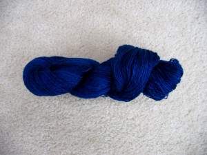
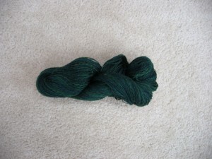
Now, why do I bring all of this up to talk about the scarf? Well, I was about to start winding the warp for the scarf when taking the workshop, with these two yarns that I spun a couple years ago from Fiber Optic’s faux batiks.
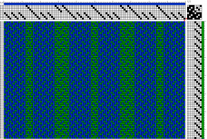
With the workshop, we got a red piece of plexiglass that we used to determine the values of colors. When I used it to get the values of these yarns, I found out that they were virtually the same value! This was going to be a problem, as the weave structure that I was planning on using would mean that the two colors were going to blend together into a single combination that was not what I was going for. Since I wanted to use these yarns to make the scarf and didn’t have time to spin a new yarn, I had to change the weave structure to something that would not have the colors blend as much. So, this is the weave structure that I changed to.
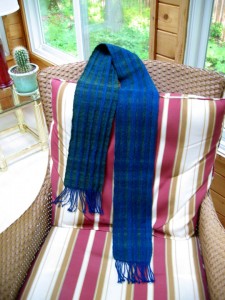
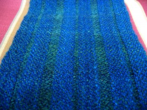
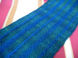
One thing about this weave structure is that it is also used for collapsed weave, and with fulling of the scarf, that is exactly what happened. I was doing a good bit of pulling with the scarf still wet, otherwise the scarf would have been only about two inches wide, rather than just over six inches. And once dry, I did a fair bit of steaming of the scarf to flatten it out a bit more. All of this resulted in what you see below.
As much as I like the “front” side,
I like the other side better, because it shows off the change in value of the green yarn.
Soon, I will start a project that uses all that I learned in that workshop, but just with what I was able to do with this scarf, I am extremely happy with what I got from the workshop.
Copyright 2012 by G. P. Donohue for textillian.com.
Comments
2 responses to “I Can See Clearly Now”
What beautiful weaving! I did not realize the front and back of your scarf were so different. I did not want to get too close to it at the festival for fear of someone swooping in on me and kicking me out of the Skein & Garment building. I, too, struggle with using color and I appreciate your thorough explanation of your class and how you applied it to your scarf. I can’t wait to see your next project 🙂
[…] It is BFL wool, dyed by Fiber Optic Yarns. More specifics can be found about it here. […]